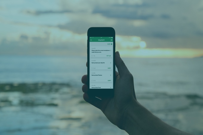
Questionnaire design in mobile devices is one of the essential elements in constructing a successful mobile market research study.
Just as online surveys changed questionnaire design from telephone data collection, the rise in mobile surveys and the availability of mobile panels has forced the industry to review and update some elements that have been taken for granted. And while the basics of good questionnaire design have not changed, it is important to take into account the way people use their smartphones, and the unique interface and functionality.
Learn about Mobile Research in our Mobile 101 eBook
Designing Surveys for Mobile Devices
Start Fresh
Five minutes is the average time consumers interact with a mobile app, so it is important to keep mobile studies in the eight to 10-minute range. Starting with an existing questionnaire will likely require extensive editing and can result in too long a questionnaire. By starting fresh, you can create a more focused survey that will be more effective and garner higher participation and completion rates.
Consider the View
Mobile devices allow for a seamless change from portrait to landscape orientation – make sure your survey works in both. This means full answer choice lists should be visible in landscape/horizontal view and grids should fit in portrait/vertical view. Anything requiring pinching or scrolling may lead the respondent to miss choices which will compromise data quality.
Limit Design Elements
Mobile users are impatient so mobile load times must be quick (under three seconds according to Google). Eliminate graphics, headers, footers, and other elements that are not essential to the questionnaire. And with the shorter survey length, the progress bar is unnecessary.
Edit Question Length
The language of mobile is short and to the point and so your questions and attributes should be too. The challenge is to ensure that intent and meaning is not lost. Start by eliminating needless instructions (“From the list below, please choose…”) that are often carried over from online (and even telephone) surveys. Also review directions at the end of questions, such as “Choose one item below” when the question and the response functionality make the choice self-evident.

Leverage Mobile Functionality
First and foremost, make sure your survey platform supports key mobile functions. Some functional elements that are taken for granted with online survey design may not translate well to mobile. Long drop down lists are difficult to use, so consider steppers or radio groups – research shows these functions result in a 40% quicker execution time. Sliders are also a good alternative when using scales.
Add Media
Mobile has the unique advantage of allowing respondents to quickly and easily add photos, voice notes, and video. These can be particularly insightful for shopper insights, diary panels, and day-in-the-life studies. But don’t overdo it. If your survey has numerous requirements for media uploads, be sure your survey invite specifically outlines the requirements for the study.
Lastly and perhaps most importantly, thoroughly pre-test your survey. A good mobile survey platform should allow you to use all key mobile functionality and be optimized for both iOS and Android.
As you review your survey on the mobile device, don’t just give it a cursory review; look for opportunities to upgrade the experience. Your respondents will appreciate the effort and you’ll be rewarded with greater engagement and better insights.
Due to advances in mobile device technology and widespread adaption of mobile phones for online access, especially in Asia, mobile research has become a powerful tool for market researchers to harness. If you want to know more about mobile research, how to enhance your methodology toolbox, and Asia mobile panels, check out our Mobile Research Essentials page.


 Download Panel Book


